Learning Center
How to plot a univariate function automatically?
SAFE TOOLBOXES® offers you the possibility to plot a univariate function seamlessly. In Excel sense, a univariate function can be thought as a function that maps the value of a single input cell to a result in one output cell.
The output function can contain a reference to multiple cells. In this case, a univariate plot can be done by selecting one input cell to change and keeping the others untouched. In math terms, this is the definition of a level curve plot.
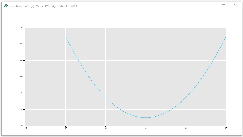
An example is a good way to understand how to use this tool. Suppose you have the following spreadsheet and want to see how the values of cell B3 affects the values of cell B4 in the interval -10 to 10.
A |
B |
C |
D |
E |
|
1 |
Univariate function plot example |
|
|
|
|
2 |
|
|
|
|
|
3 |
x |
2 |
=2 |
|
|
4 |
f(x)=x^2+10 |
14 |
=B3^2+10 |
|
|
5 |
|
|
|
|
|
To get the level curve plot, follow these steps:
- Select the General Toolbox tab;
- Click on button “Level curve”;
- Set cell B4 as the output function and B3 as the input function;
- Define the plot interval from -10 to 10;
- Choose a number of points to evaluate the function (for instance, 50 points);
- Pick a method to select the evaluation nodes (i.e., the x-values) within the interval. There are two options: the equidistant nodes or the Chebyshev nodes. For this example, we are going to select the “Chebyshev nodes” option. Chebyshev nodes form a good set of nodes for polynomial interpolation since they often produce better approximations than equidistant nodes.
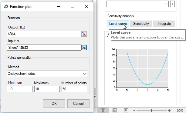
After clicking “OK” the plot will be shown in the tab ![]() . You can double click it to get the chart zoom.
. You can double click it to get the chart zoom.